If you click on links we provide, we may receive compensation.
Cabinets take up most of a kitchen’s visual weight, so their color sets the tone for everything else.
The shades below come from designers who lean on them again and again, and they run the full range. Soft sage. Crisp white. Warm cream. Deep navy. A few quiet blues, a couple of grounded neutrals, and some confident black.
None of them feel trendy in a way that’ll age fast. Here’s where to start.
1 Soft Sage Cabinets
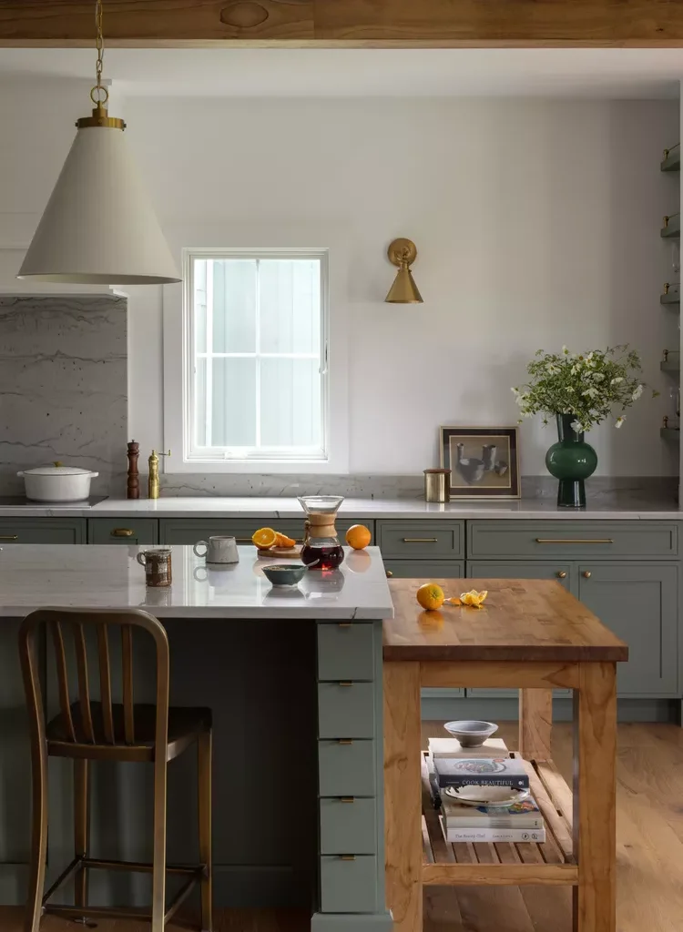
A soft sage green settles over the cabinets in this country kitchen, sitting easily against pale white walls and exposed wood beams. The tone is mid-range and natural not too bright, not too muted. It feels relaxed and a little rustic. Sherwin-Williams calls it Dried Thyme.
2 Crisp Beachy White
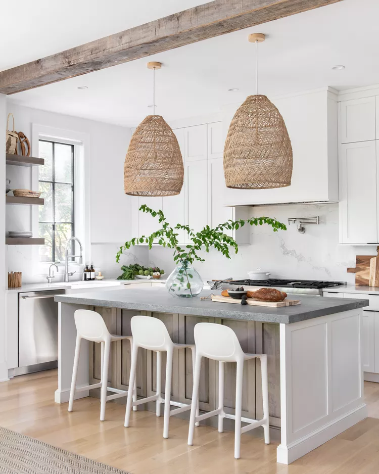
Crisp white cabinetry keeps this space light and breezy, playing off natural details like wood beams and rattan lighting. The white reads clean but warm, never cold. An easy, beachy backdrop. Benjamin Moore’s Swiss Coffee.
3 Bright Historic White
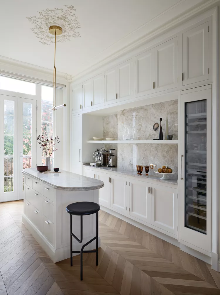
In this narrow kitchen, a crisp white lets light flood the whole space. The shade feels both historic and a little luxurious, with traditional and modern details sitting comfortably side by side. Balanced and calm. Benjamin Moore’s Lime White.
4 High-Gloss Dusty Green
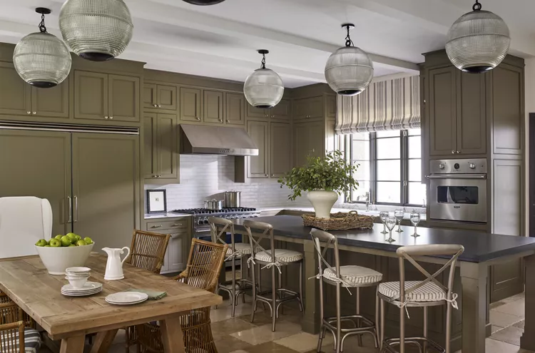
Here a dusty green gets a high-gloss finish, so the cabinets pick up a mirror like shine and bounce light around the room. The color stays understated, but the sheen gives it presence. A green pulled from the landscape, dressed up just enough. This one’s CG59 by Fine Paints of Europe.
5 Warm Creamy White
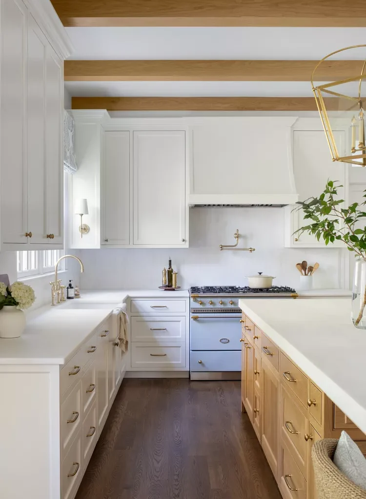
A soft cream covers these cabinets, reading almost white depending on the light. It’s a warm off-white with creamy undertones, so it softens the room instead of going stark. Works nicely against the surrounding wood tones. White Dove by Benjamin Moore.
6 Rich Peacock Navy
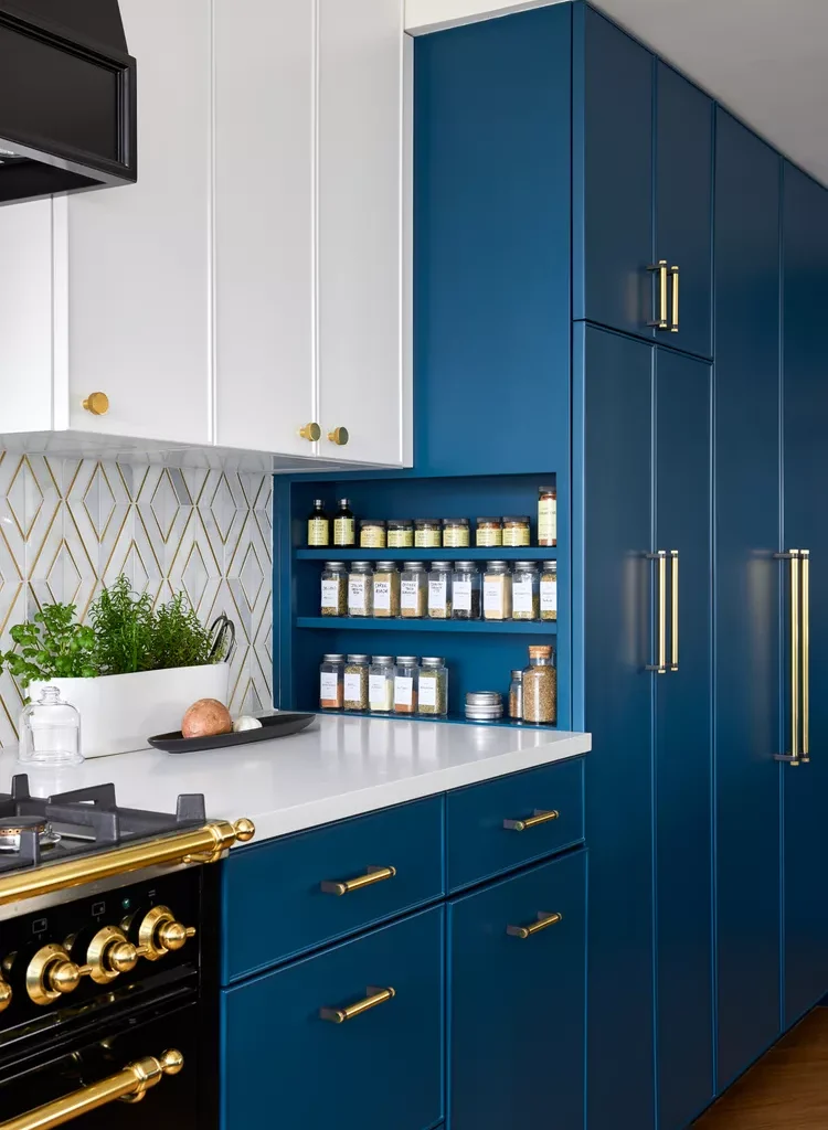
A deep, peacock-inspired navy gives these cabinets a rich, saturated look without tipping into garish. Paired with gold and brass tones, the blue feels even more luxe. Dramatic, but grounded. Hidden Sapphire by Benjamin Moore.
7 Frothy Cream Cabinets
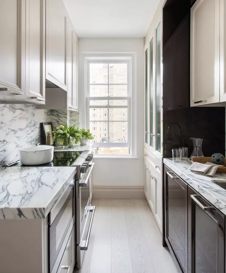
A frothy cream keeps things quiet in this narrow city kitchen, balancing out bolder elements like heavily veined marble and dark wood accent cabinetry. The cream hangs back and lets those finishes stand out. Benjamin Moore’s Collingwood.
8 Stormy Gray-Blue
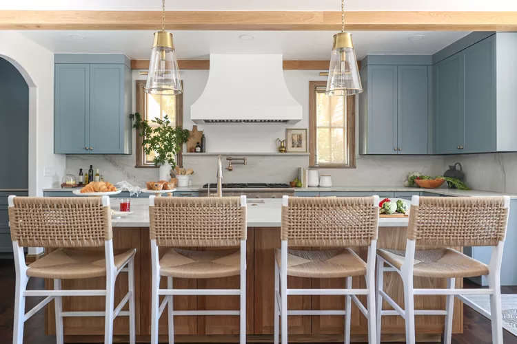
A stormy gray-blue brings a cozy pop of color to this family kitchen, sitting alongside coastal textures like seagrass, rush, wicker, and rattan. The shade is soft and approachable, more relaxed than bright. Parma Gray by Farrow & Ball.
LEARN MORE: 9 Fresh Paint Colors Designers Are Loving for the New Year
9 Bold Nautical Navy
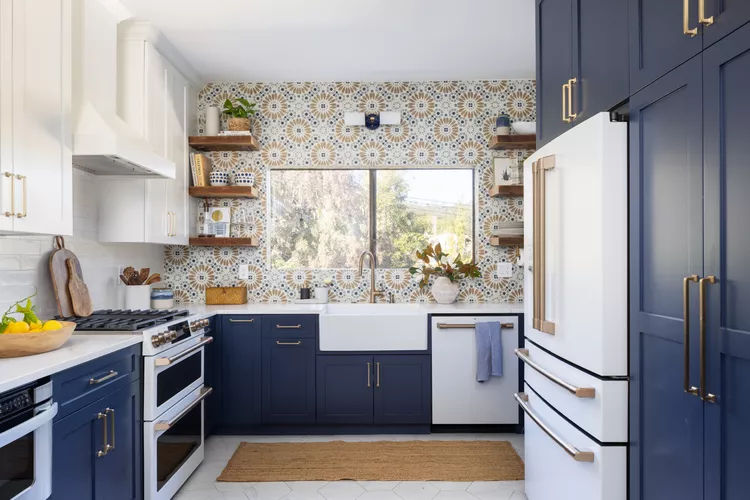
This nautical navy holds its own against piles of pattern and bold tile. Because the shade reads almost like a neutral, it grounds the busier elements instead of competing with them. Confident and classic. Sherwin-Williams’ Naval.
10 Soft Greige Cabinets
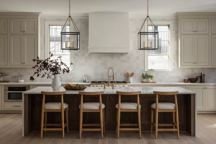
Greige cabinetry warms up this kitchen, landing somewhere between beige and gray. It complements creamy white walls and a counter-to-ceiling zellige backsplash that echoes the cabinets’ brown, cream, and gray undertones. Cohesive and easy. Accessible Beige by Benjamin Moore.
11 Whisper of Sky Blue
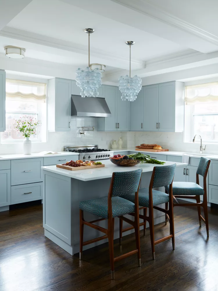
An unexpected sky blue gives these cabinets just a whisper of color, kept clean and classic. It plays against handsome finishes and dramatic dark wood floors for a little contrast. Quiet, but not plain. Dusky Blue by Benjamin Moore.
12 Mushroom Taupe Cabinets
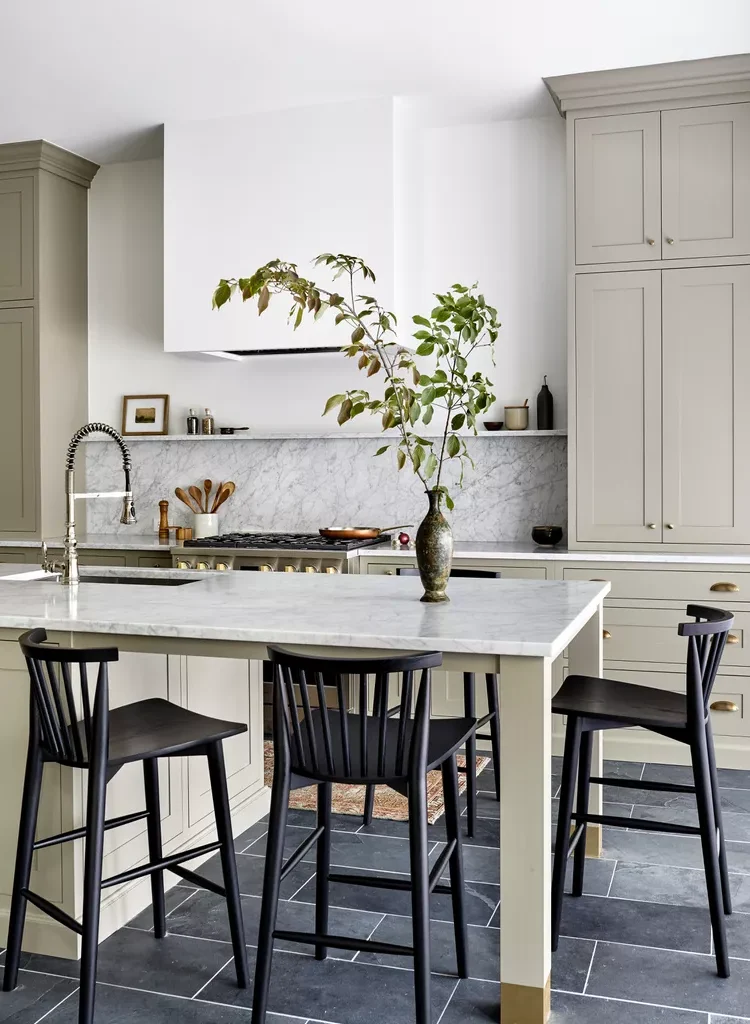
A mushroom taupe gives these cabinets a nuanced, taupe-meets-gray color that shifts in the light. It’s set against rich slate flooring and inky black details, turning the kitchen into a study in contrast. Sophisticated and warm. Often compared to Sherwin-Williams’ Agreeable Gray.
13 High-Gloss Jet Black
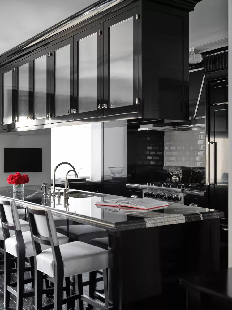
A high-gloss, jet-black finish covers the cabinetry and island here, bringing a sleek, polished look to a city kitchen. The shine keeps the dark color from feeling heavy. Dramatic and endlessly versatile like eyeliner for the room. Black in High Gloss by Fine Paints of Europe.
14 Bold Black Contrast
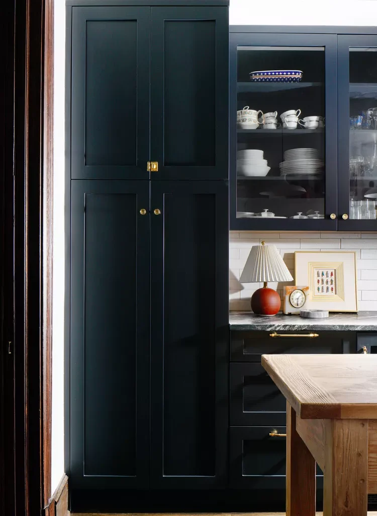
Black cabinets create a bold contrast against white walls and subway tile, and because the kitchen is bathed in natural light, the dark color never feels cave like. Sharp, dramatic, and still bright. Soot by Benjamin Moore.