If you click on links we provide, we may receive compensation.
We’ll say it first: warm colors have a real hold on us. There’s always something exciting about a punchy red, orange, pink, or yellow. But if we’re honest, cool colors are the ones we actually reach for most. And it’s easy to see why. Blues, purples, and greens come in such a wide range of shades and moods, and they can swing from easy and laid-back to luxe and dramatic without missing a beat. The chameleons of the color wheel, basically.
If you’re eyeing a redecorate and finding yourself drawn to the cool end of the paint aisle, you’re in good company. Some of the best designers go back to these palettes again and again. Here are seven worth borrowing, whether you’re after something crisp and coastal or a little more glam.
01 Gray-Green + White + Wood
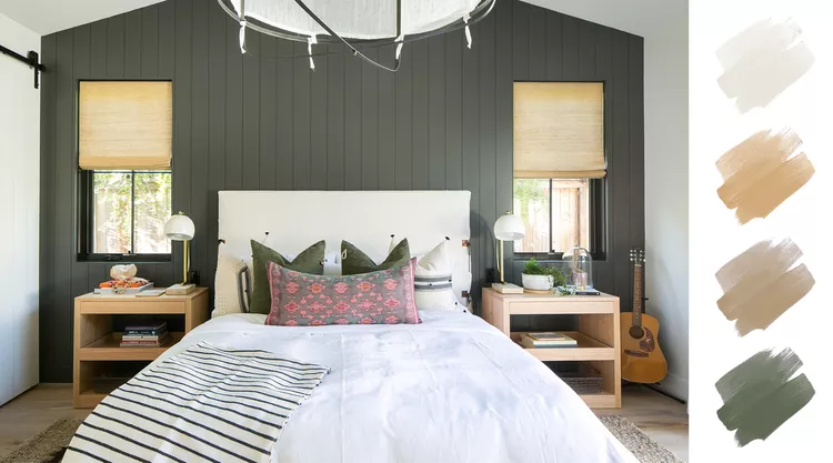
A gray-blue or gray-green is always a mood, but this in-between shade might be the best of the bunch. As the story goes, this back wall was almost painted plain white. A last-minute switch to gray-green completely shifted the feel of the room. Even alongside a restrained mix of natural wood, white, and the faintest hint of pink, it carries real weight. It’s the kind of color that adds something almost like texture, all on its own.
02 Emerald Green + Rich Navy + Dark Wood
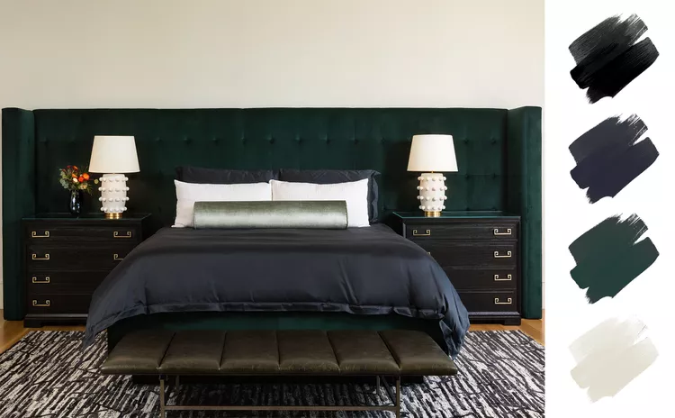
This one’s for the dark-and-moody crowd. Glam but a little masculine, it pulls off the tricky move of layering several dark hues at once. The contrast between deep and lighter greens gives the bedroom a rich, easy sense of calm, while clean pops of white keep everything modern. Most of the drama comes from a 15-foot custom emerald headboard that anchors the whole room. Its custom wings add visual weight and balance the color across an oversized primary suite.
03 Pink + Teal + Gray
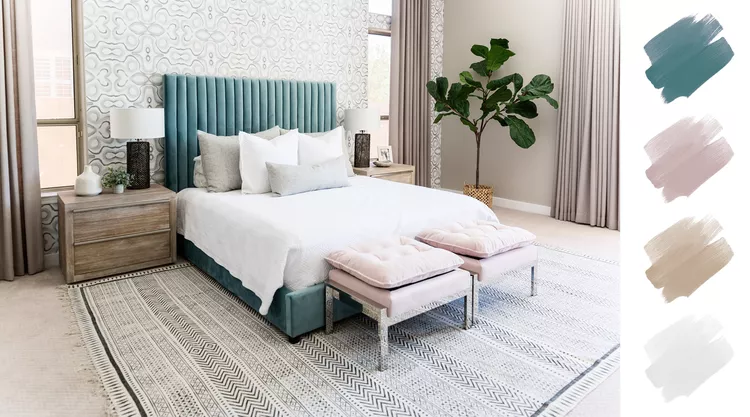
You heard it here first: pink can absolutely be a cool color, at least when it leans toward the muted, grayed-out side. This room was designed for a family that had traded up to a lot more square footage and wanted to use it well. The look blends grays, teals, and blush together so smoothly that at first glance it reads mostly neutral. Keep looking, though, and the depth starts to show. The rich teal upholstered bed is the clear crown jewel.
04 Dark Blue-Green + Black + White
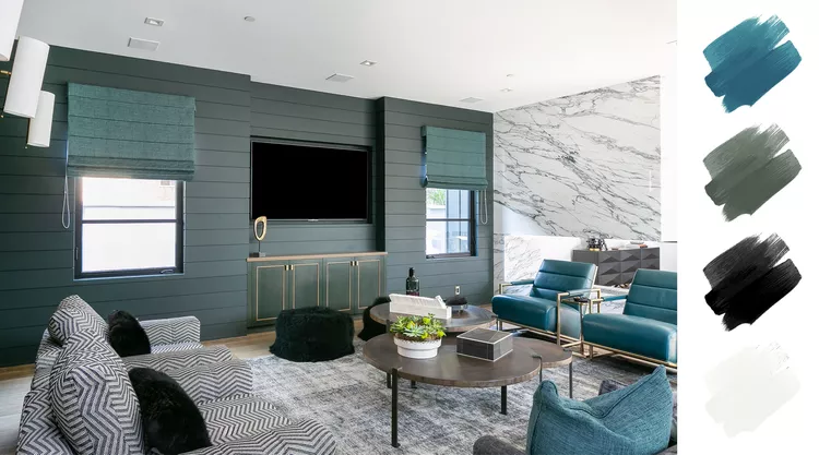
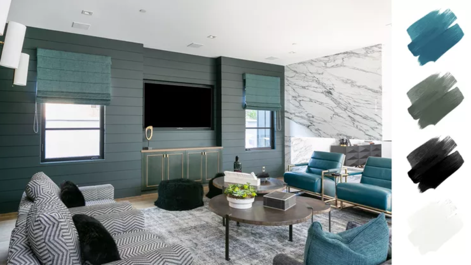
Texture, pattern, natural materials, moody color: this living room has all of it. The dark blue-green shows up across the wall paint, the window treatments, and a pair of upholstered chairs, tying everything together and freeing up room to have fun with the rest. The goal was something sophisticated with a playful twist of pattern and texture, a room that feels inviting, warm, and moody all at once. High-contrast black and white, by way of a patterned couch and dramatically veined marble, finishes off the look.
05 Blue-Gray + Warm Wood + Chrome
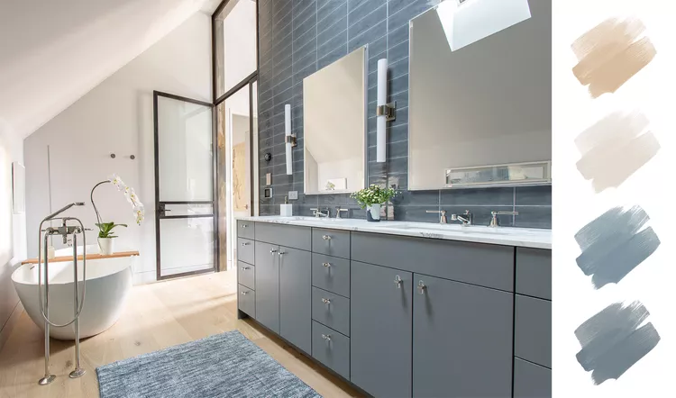
Opposites attract, and this bathroom is the proof. A sleek, modern vanity in cool gray-blue plays against warmer wood tones and the more wabi-sabi feel of the soaking tub. The surroundings did the inspiring here: a calming mountain setting called for cool blues balanced by a natural palette, meant to capture the shifting light bouncing off the peaks around this Colorado valley home.
06 Dusty Blue + Cream + Rich Wood
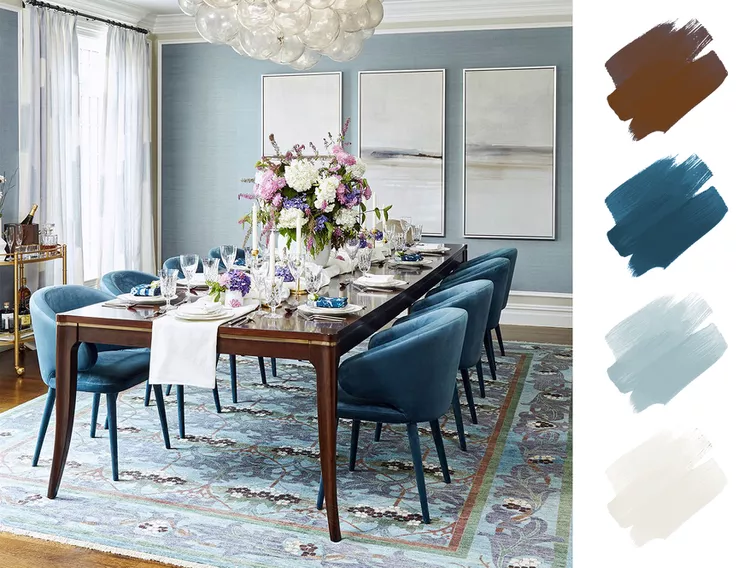
For a cool color, this blue room feels plenty warm and welcoming. Blue is endlessly flexible for interiors; there’s a version of it for any room and any mood. Here, a dusty gray-blue sisal wallpaper grounds the space, matched with creamy crown molding, and rich blue velvets crank up the polish, ideal for a more formal dining or sitting room. Nothing is too matchy, though; the room pulls from several shades in the same family. If you want to stay in a blue palette but still work in other hues, the accents are the place to do it: artwork, a rug, tabletop pieces. A rug with a vibrant pattern makes a dramatic focal point, while pastels and creamy whites soften things.
07 White + Green + Blue
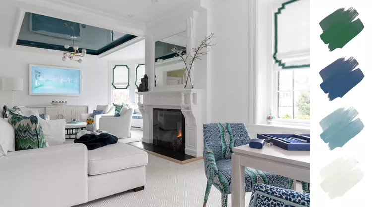
Here’s proof that cool colors can shine even used sparingly. This client loves green, and the goal was to bring the outdoors in. A nearby dining room already had green and black wallpaper, so rather than match it, the aim was a space that would live in harmony with it. A playful printed fabric became the jumping-off point for the whole room, right down to the ceiling color chosen for the seating area. Painted in a brilliant glossy finish, it created a deep-water effect that pulled the room together dramatically against all the white furniture. A few more touches of blue and green round it out, like the geometric trim on the window treatments and a handful of throw pillows. In the end, it comes down to juxtaposition: you just have to find the balance.
RELATED: 7 Black and White Bedroom Ideas That Never Go Out of Style